Styling with Emotion JS
JSS came along as an easy answer to dynamic CSS, and offering CSS properties as their own camel-cased properties. While JSS requires the CSS user to change some practices, it works quite well. Emotion takes this a bit further allowing for raw CSS styling, but also allowing you to create dynamic styles. Emotion’s styling system and composition make for an incredibly light-weight styling solution, and allow you to style React components directly. Let’s look at how to style in Emotion JS and how to make some really light-weight presentation components in the process.
I ran across Emotion when looking for lightweight solutions for a new module. Using Styled-Components or Material-UI would have been overkill, but using React styling wouldn’t offer the flexibility needed for the module. Emotion is certainly the answer to this use-case, and brings a unique composition to the JavaScript Styling Ecosystem.
Styling with Emotion JS
Emotion offers a few different packages based on their use-case. The most basic package is the @emotion/css module, which can be used to handle dynamic css styles using CSS Styling Strings. These strings are then passed to the components to apply the styles.
One great thing about Emotion’s CSS module is that it offers a uniform way to style regardless of how you end up using Emotion. Styling using JavaScript DOM manipulation works the same way as styling in React. The difference is how the style is passed to the component. Here’s an example of each:
import { css } from '@emotion/css'

const element = document.findElementById('app')
const styles = {
  color: css`
    color: blue;
  `
}

element.classList.add(styles.color)
With React there are several ways to add styles. The easiest way being to use the css styling strings with the element className.
import { css } from '@emotion/css'

const divStyle = css`
  background-color: white;
  &:hover {
    color: ${props.color};
  }
`

render(
  <div className={divStyle}>
    This text has a white background
  </div>
)
You can already see that we use CSS in a template string, which allows us to easily add dynamic values.
Emotion Styling with React CSS Prop
The other option for React relies on replacing React’s createElement with Emotion’s own jsx function. This function will create new elements with a css prop, which adds more functionality for styling. Depending on your version of React, you may need to use pragmas or update your babel config to automate support. You can read more about the different ways to add support in the css prop docs.
With the CSS prop we can pass our styles to any React component:
import { css } from "@emotion/react";

const NewButton = ({ text }) => {
  const buttonStyle = css`
    border: 1px solid black;
    padding: 6px 10px;
    margin: 6px 10px;
    border-radius: 4px;
  `;

  return (
    <button css={buttonStyle}>
      {text}
    </button>
  );
};

export default NewButton;
We are again using the Styling Strings, but we can also use style objects with JSS instead:
/** @jsxImportSource @emotion/react */
import { css, jsx } from "@emotion/react";

const NewButton = ({ concatstyle, text }) => {
  const buttonStyle = {
    backgroundColor: "blue",
    color: "white",
    border: "1px solid black",
    padding: 10,
    margin: 4,
    borderRadius: 20
  };

  return (
    <button css={buttonStyle} concatstyle={concatstyle}>
      {text}
    </button>
  );
};

export default NewButton;
Programmatic Styling in Emotion
If we want to create truly dynamic components, let’s look at how to dynamically create components with styles. Using Emotion’s JSX function we can manually create new components with our css prop:
import { css, jsx } from "@emotion/react";

const DynamicComponent = ({ Component, css, children }) => {
  return jsx(Component, {
    css: css,
    children: children
  });
};

export default DynamicComponent;
With this simple template we can create any component dynamically, passing it any css parsable style, and its children. We won’t use this particular component, but let’s create a button component in a similar way:
import { css, jsx } from "@emotion/react";

const Button = ({ concatstyle, text }) => {
  return jsx("div", {
    css: [
      css`
        border: 1px solid black;
        padding: 6px 10px;
        margin: 6px 10px;
        border-radius: 4px;
      `,
      concatstyle
    ],
    children: text
  });
};

export default Button;
So we created a similar button component which takes in a couple different properties. In addition to Styling Strings and objects, the css prop can also take an array of strings. So we take in a concatstyle property, which appends an additional style to the existing style.
Emotion JS Composition
Taking the above example to a greater level, let’s look at how we can create a component that applies styles to all of its children. You can find a working example in this codesandbox project.
import React from "react";

const StyleComponent = ({ children, childProps, concatstyle }) => {
  return React.Children.map(children, (child) =>
    React.isValidElement(child)
      ? React.cloneElement(child, {
          ...childProps,
          concatstyle: [concatstyle, childProps.concatstyle]
        })
      : child
  );
};

export default StyleComponent;
The above component takes any style passed to the component and applies it to all child components. In the following example we apply colors to two component groups, and apply additional styles to a nested group:
...
function addColor(textColor, color) {
return css`
background-color: ${color};
color: ${textColor};
`;
}
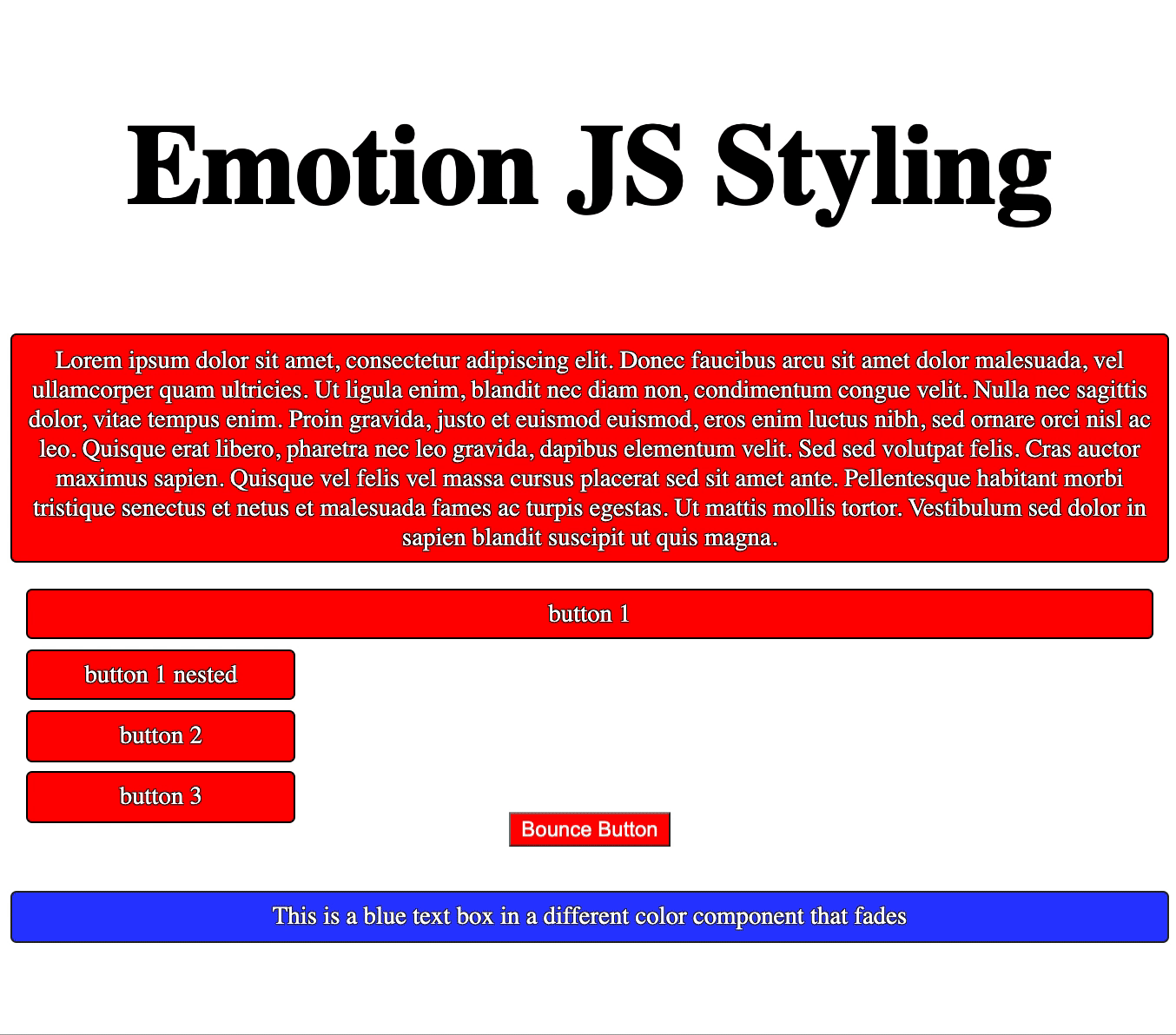
return (
<div style={{ textAlign: "center" }}>
<Header text="Emotion JS Styling" />
<StyleComponent
childProps={{
concatstyle: addColor("white", "red")
}}
>
<TextBox text="Lorem ipsum dolor sit amet, consectetur adipiscing elit..." />
<Button text="button 1" />
<StyleComponent
childProps={{
concatstyle: css`
width: 150px;
`
}}
>
<Button text="button 1 nested" />
<Button text="button 2" />
<Button text="button 3" />
</StyleComponent>
</StyleComponent>
<StyleComponent
childProps={{
concatstyle: addColor("white", "blue")
}}
>
<TextBox text="This is a blue text box in a different color component" />
</StyleComponent>
</div>
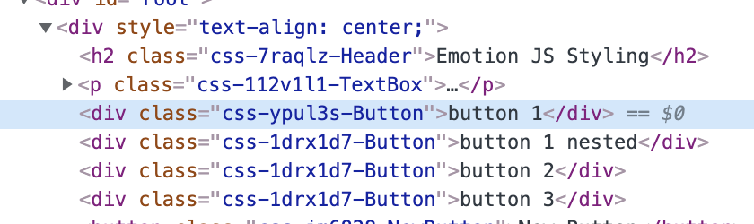
);By digging into our example we can see how we apply styles to our children, and apply additional styles to 3 nested buttons. It’s with this sort of composition we can see the power of Emotion’s styling system. If we look at the DOM tree for our example we will see that we’re creating a minimal amount of elements. For those using styled-components or Material-UI, this is a drastic reduction of elements on the DOM.
CSS Animations with Emotion JS
Like styling, Emotion makes it easy to create compositions around CSS animations. A big part of this functionality comes from the keyframes function available in Emotion. With this function we can create our CSS keyframes, and put them into a variable. Like our styles, we can pass our animations through props, and apply them to our style. Here’s a quick example of a bounce effect being applied to Emotion’s CSS styling:
const bounce = keyframes`
  from, 20%, 53%, 80%, to {
    transform: translate3d(0,0,0);
  }

  40%, 43% {
    transform: translate3d(0, -30px, 0);
  }

  70% {
    transform: translate3d(0, -15px, 0);
  }

  90% {
    transform: translate3d(0,-4px,0);
  }
`;


return (
  <div css={
    css`
      animation: ${bounce} 1s ease infinite;
    `}>
    Bounce!
  </div>
)
Since we can separate our keyframes from our style, we can share our animations. I’ve created a separate object to store and share my keyframes for all elements:
import { keyframes } from "@emotion/react";

const Animations = {
  bounce: keyframes`
    from, 20%, 53%, 80%, to {
      transform: translate3d(0,0,0);
    }

    40%, 43% {
      transform: translate3d(0, -30px, 0);
    }

    70% {
      transform: translate3d(0, -15px, 0);
    }

    90% {
      transform: translate3d(0,-4px,0);
    }
  `,
  fade: keyframes`
    0% {
      opacity: 0
    }
    100% {
      opacity: 1
    }
  `
};

export default Animations;
Now I can import my Animations object, and use it to apply animations to the style overrides:
...

        <StyleComponent
          childProps={{
            concatstyle: css`
              animation: ${Animations.bounce} 1s ease infinite;
            `
          }}
        >
          <NewButton text="Bounce Button" />
        </StyleComponent>
      </StyleComponent>
      <StyleComponent
        childProps={{
          concatstyle: addColor("white", "blue")
        }}
      >
        <StyleComponent
          childProps={{
            concatstyle: css`
              animation: ${Animations.fade} 1s ease infinite;
            `
          }}
        >
          <TextBox text="This is a blue text box in a different color component" />
        </StyleComponent>

...
By adding these we end up with two separate animation groups where the animation is applied to the children:
Conclusion
How you handle styling with Emotion is incredibly flexible, and it’s probably obvious how it’s built specifically for composition. While this isn’t the extent of its abilities, it should give you a good idea of how it’s beneficial, and how to use it for styling. If you want to learn more about how Emotion works with MUI v5, be sure to check out MUI v5 with Emotion.
If you have any questions, or want to know more about this topic, please let me know in the comments. Until next time, happy coding!
Comments: 1
Super useful, thanks!