MUI v5 with Emotion
Since the long-awaited release of MUI v5 (Material-UI), a lot has changed, and the migration comes with its own codemod to help make this process easier. The migration guide also focuses on how to ease your app into MUI v5, but by transitioning your into using MUI v5 in a v4-type of way. In this article I’m going to show you another way to migrate to version 5 using emotion, as well as how to use MUI v5 to style your apps. If you haven’t had a chance to use Emotion yet, you are definitely in for a treat. So, let’s look at using MUI v5 to style our app, and also compare workflows to version 4.
This article is specifically about the basics of styling in MUI v5 without styled-components. If you want to learn about the new theming system in MUI v5, you may prefer the article MUI Themes with MUI v5.
With Emotion?
If this is your first time hearing about Emotion, let’s quickly introduce you. Emotion is a fairly new CSS-in-JS styling library which is perfect for dynamic CSS, and incredibly light. With it you create your CSS properties in Emotion’s CSS template string, and pass it to its own JSX component which applies the style.
Another great feature is its ability to handle animations, providing its own keyframes function, which allows you to create dynamic CSS animations. It also offers additional functionality for Server-Side Rendering and caching to improve performance even more. When you have a chance, check out the rest of Emotion’s features
Styling in MUI v5
In Material UI version 4 we use the makeStyles hook to create our style object, and use the generated classes with our components or JSX tags. For example, here’s the Header object from the previous version of my Gatsby Redux MUI Boilerplate using MUI v4.
import * as React from "react"
import PropTypes from "prop-types"
import { Link } from "gatsby-theme-material-ui"
import { makeStyles } from "@material-ui/core/styles"

const Header = ({ siteTitle }) => {
  const useStyles = makeStyles(theme => ({
    header: {
      background: theme.palette.primary.main,
      marginBottom: `1.45rem`,
    },
    link: {
      color: theme.palette.primary.contrastText,
      textDecoration: `none`,
    },
    title: {
      margin: `0 auto`,
      maxWidth: 960,
      padding: `1.45rem 1.0875rem`,
    }
  }))

  const classes = useStyles()

  return (
    <header
      className={classes.header}
    >
      <div
        className={classes.title}
      >
        <h1 style={{ margin: 0 }}>
          <Link
            to="/"
            classes={{root: classes.link}}
          >
            {siteTitle}
          </Link>
        </h1>
      </div>
    </header>
  )
}

Header.propTypes = {
  siteTitle: PropTypes.string,
}

Header.defaultProps = {
  siteTitle: ``,
}

export default Header
Need to know more about styling and theming with Material-UI version 4? Check out my article on Using Material UI Themes in React.
The biggest chance comes from the way styling is handled, as we no longer use makeStyles to apply styles. Instead, mui v5 can use objects of styling properties like so:
const styles = {
    header: {
      backgroundColor: 'red',
      marginBottom: '1.45rem'
    }
  }
You can then pass that object to the MUI component’s new sx property. For components with multiple components, each component has a “sx” property. We can use this property on the root component, or even the child components through the Component API.
<Input
  sx={styles.root}
  InputProps={
    sx: { height: 0 }
  }
/>
Unfortunately, this won’t work with your JSX tags, but we do have an alternative available without styled-components. We can use Emotion directly for our MUI components, as well as our JSX tags. Here’s that same header but with MUI v5 and Emotion Styling Strings:
/** @jsxImportSource @emotion/react */
import { jsx, css } from "@emotion/react"
import MuiLink from "@mui/material/Link"
import { Link as GatsbyLink } from "gatsby"
import { useTheme } from "@mui/material/styles"
const Header = ({ siteTitle }) => {
const theme = useTheme()
const styles = {
header: css`
background-color: ${theme.palette.primary.main};
margin-bottom: 1.45rem;
`,
link: css`
color: ${theme.palette.primary.contrastText};
text-decoration: none;
`,
title: css`
margin: 0 auto;
max-width: 960;
padding: 1.45rem 1.0875rem;
`
}
return (
<header css={styles.header}>
<div css={styles.title}>
<h1 style={{ margin: 0 }}>
<MuiLink
component={GatsbyLink}
to="/"
sx={styles.link}
>
{siteTitle}
</MuiLink>
</h1>
</div>
</header>
)
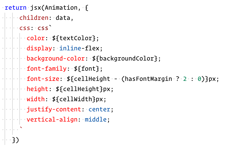
}Similar to mui v4, it has a single object for holding dynamic styles, and placing them onto our components. This object is made up of Emotion CSS Styling Strings, which you can see are written with template strings. Most importantly, you’ll notice that JSX tags have a css property, which comes from Emotion. If you look at the first line, you’ll see a inputSource pragma which is replacing React’s jsx function with Emotions, providing the css prop to all JSX tags. It’s worth noting that this gives you all of the functionality of Emotion, and you can of course write the styling a number of ways, including in-line. Using in tandem with the useTheme hook, we can use the MUI theme just like we could in v4.
If you want to learn more about styling with Emotion check out Styling with Emotion JS.
Flexible Styling Objects
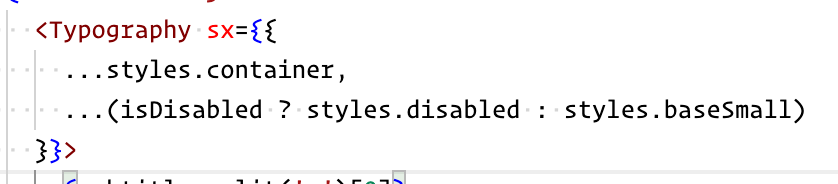
Emotion styling strings are a great way to style both objects, but it’s not great in certain use-cases. The biggest issue comes when you want to use more than one style object in a single sx prop. When using the sx property we cannot use multiple Styling Strings, even when using cx. With JSS objects we can spread multiple style objects over an sx property, and without even needing classnames, clsx, or cx:
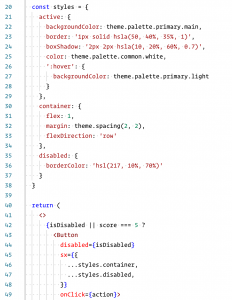
Similarly speaking, we can use the same method to spread over a conditional as well.
Using Emotion the MUI 5 Way
The intended way to use this is with JSS, the sx prop, and MUI v5’s new components. Using the new components, you avoid needing to use bare JSX, and in turn avoid needing Emotion’s jsx. Let’s look at the header object again, but this time using JSS and MUI’s Box.
import { Box, Link as MuiLink, Typography } from "@mui/material"
import { Link as GatsbyLink } from "gatsby"

import { useTheme } from "@mui/material/styles"

const Header = ({ siteTitle }) => {
  const theme = useTheme()

  const styles = {
    header: {
      backgroundColor: 'primary.main',
      mb: '1.45rem' // margin bottom
    },
    link: {
      color: 'primary.contrastText',
      textDecoration: 'none'
    },
    title: {
      my: 0,  // top/bottom margin
      mx: 'auto', // left/right margin
      maxWidth: 960,
      py: '1.45rem', // top/bottom padding
      px: '1.0875rem' // left/right padding
    },
    customComponent: { // to be used with none MUI components
      backgroundColor: theme.palette.primary.main
    }
  }

  return (
    <Box component="header" sx={styles.header}>
      <Box component="div" sx={styles.title}>
        <Typography sx={{ m: 0 }}>
          <MuiLink
            component={GatsbyLink}
            to="/"
            sx={styles.link}
          >
            {siteTitle}
          </MuiLink>
        </Typography>
      </Box>
    </Box>
  )
}
It may seem like overkill at first, having the sx prop is incredibly powerful, and is what drives the majority of power in MUI v5. Not only does it offer a lot of different styling shorthand props, at also gives us a theme callback. What it can do warrants its own article, but you can get an idea of what’s available on the sx prop doc page.
Global Styling
When we need to add global styles to our app, we now have access to a new special component. In v3 and v4, you could override the style of the CSSBaseline component, but in v5 we now have the GlobalStyles component. This specific component gives us direct access to a global space for our styles. Here’s a quick example:
import { ThemeProvider } from "@mui/material/styles";
import { CssBaseline, GlobalStyles } from "@mui/material";

const inputGlobalStyles = (
  <GlobalStyles
    styles={{
      a: {
        textDecoration: "none"
      },
      "*": {
        transition: 'height 0.5s ease',
        transition: 'background-color 0.5s ease'
      }
    }}
  />
);

const rootElement = document.getElementById("root");
ReactDOM.render(
  <ThemeProvider theme={theme}>
    <CssBaseline />
    {inputGlobalStyles}
    <App />
  </ThemeProvider>,
  rootElement
Theming
While the way theming is applied hasn’t really changed in mui v5, the theme object has. It’s not a drastic change, but they do offer a V4 adapter so you don’t have to update your v4 themes in order to use mui v5. Just to give an idea of what is different, here is what has changed:
- themeName has been removed
- disabled object is now part of the action object
- palette’s type renamed to mode
- new grey object in palette
- typography’s fontWeight replaced with fontWeightLight, fontWeightRegular, fontWeightMedium, and fontWeightBold
- speedDial added to zIndex object
- new components object for overrides and variants
You can see the complete layout of new MUI v5 Default Object on the Default Object page of the docs. If you want to learn about the new theming system in MUI v5, read my article on MUI v5 Themes. In it we look at creating custom themes, and how to use the new override and variant system.
That’s it for this article! If you enjoyed this, or want to know more about these topics, please leave a comment and let me know.
Also, if you’re looking to use MUI v5 with Gatsby, or just want a working mui v5 theme example with Emotion, check out my Gatsby Redux MUI Boilerplate. 👍
Comments: 4
In artile there is
“You can then pass that object to the MUI component’s new sx property. For components with multiple classes, each class has a “sx” property.
”
I tried this inreact mui 5 but its not working the classes property expects { root: }
Can you elaborate more about the above mentioned code ?
Absolutely!
Some components will allow you to use the old MaterialUI classes styling, and pass the styling to the SX property of that particular object, but there are many that do not. I added this as a migration option, but since writing this article I found support for this was limited to certain components, and it’s just as easy to use the new method of applying styles.
It is just as easy and much better to use the ChildComponentProps properties to pass your styling to child components.
Here’s an example:
…
Thank you for the question, and I went ahead and updated the article to cover this. 🙏
How can I call the global styles in my components?