React Animations with React Transition Group
When the time comes to add the polish to your apps, animations cannot often be overlooked. Even simple animations make a world of difference in your app’s presentation. We will take a look at how to quickly add transition animations using react-transition-group.
Understanding Animations in React
It’s not hard to see that animations are handled differently in React. The way react-transition-group handles this, is with a simple transitional state. Rather the animation is entering a transition, or exiting a transition. When our state changes, we see an animated transition.
We will look at some altered versions of the official RTG examples to demonstrate how to use this library to create animations. All code in this article can be found in the following Code Sandbox.
Animations in React Transition Group
React Transition group handles simple transitional animations, hence the name. Any animation that has a starting and stopping point, you can create with this module. The animation you want to create determines which class module to use. Let’s take a look at each, and what they work best for.
Transtion Animations
The Transition module is the simplest module within react-transition-group. It takes in the criteria for the starting point, and stopping point. It does this for the entrance transition, and the exit transition. The idle position of the component is your starting point, where the final destination of the animation is the stopping point.
Let’s demonstrate this with a fade example, where we animate opacity. Our starting point will be an opacity of 1, so we want to transition to opacity of 0, when our state changes. We start creating our animation by setting up our CSS transition into a defaultStyle object, then creating a transitionStyle object with our opacity values. The transition component has an entered, entering, exited, and exiting prop so we can tell the component what to do at each end of the transition animation. In our fade, we use the entered, and exited prop value, setting the entered to “opacity: 1” (opaque), and exited to “opacity: 0” (transparent).
With the CSS portion taken care of, we can now wrap the components we want to animation with our Transition component. We then spread the CSS styles objects into the style prop of the children that we want to fade. All that’s left is to add a state switch, and set the Transition component to animate based on that state.
import React, { useState } from "react";
import { Alert, Button } from "react-bootstrap";
import { Transition } from "react-transition-group";

const duration = 300;

const defaultStyle = {
  transition: `opacity ${duration}ms ease-in-out`,
  opacity: 0
};

const transitionStyles = {
  entered: { opacity: 1 },
  exited: { opacity: 0 }
};

export default function Pulse() {
  const [inProp, setInProp] = useState(false);

  return (
    <Transition in={inProp} timeout={duration}>
      {(state) => (
        <>
          <div
            style={{
              ...defaultStyle,
              ...transitionStyles[state]
            }}
          >
            <Alert variant="primary">
              {inProp ? "Hello!" : "I'm fading!"}
            </Alert>
          </div>
          <Button onClick={() => setInProp(!inProp)}>
            Click to Fade {inProp ? "out" : "in"}
          </Button>
        </>
      )}
    </Transition>
  );
}
As you can see, this is a very simple implementation, but even this slight addition can make a world of difference.
Using CSS Transistions
Transitions are simple, so when you want to create a specific animation you can use the CSSTransition component. This component gives you the ability to set the animation based on CSS properties. Similar to our Transition animation, we our animation is based on styling we set. Instead of using a styling object, we set a style prefix, and write our styles in CSS.
Here is our CSSTransition animation in React:
import React, { useState } from "react";
import { Alert, Button, Container } from "react-bootstrap";
import { CSSTransition } from "react-transition-group";

import "./styles.css";

export default function CSSAlert() {
  const [showButton, setShowButton] = useState(true);
  const [showMessage, setShowMessage] = useState(false);
  return (
    <Container style={{ paddingTop: "2rem" }}>
      {showButton && (
        <Button onClick={() => setShowMessage(true)} size="lg">
          Show Message
        </Button>
      )}
      <CSSTransition
        in={showMessage}
        timeout={300}
        classNames="alert"
        unmountOnExit
        onEnter={() => setShowButton(false)}
        onExited={() => setShowButton(true)}
      >
        <Alert
          variant="primary"
          dismissible
          onClose={() => setShowMessage(false)}
        >
          <Alert.Heading>Animated alert message</Alert.Heading>
          <p>This alert message is being transitioned in and out of the DOM.</p>
          <Button onClick={() => setShowMessage(false)}>Close</Button>
        </Alert>
      </CSSTransition>
    </Container>
  );
}
The “classNames” prop used in our CSSTransition component set our class name prefix. In the alertStyles css file, we find our transition classes.
.alert-enter {
  opacity: 0;
  transform: scale(0.9);
}
.alert-enter-active {
  opacity: 1;
  transform: translateX(0);
  transition: opacity 300ms, transform 300ms;
}
.alert-exit {
  opacity: 1;
}
.alert-exit-active {
  opacity: 0;
  transform: scale(0.9);
  transition: opacity 300ms, transform 300ms;
}
Just like our Transition’s enter and entered states, CSSTransition uses the Enter and Enter-Active classes for the entrance animation. The Exit and Exit-Active classes are for our reverse animation. While this works similarly to Transition, Unlike the Transition, we have much more control over our animations.
Using Switch Transitions
The Switch Transition is useful when you want to control the transitions between renders. This is easier demonstrated in the example. The component has two different modes to determine its behavior: The first, out-in which waits for the old child to transition before transitioning the new child. The second, in-out mode starts the transition for the new child first, and then the transition for the old child.
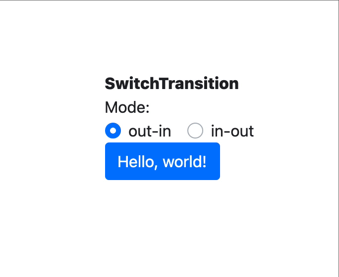
In our example we create this same example, using the Switch Transition, and a CSSTransition component.
import React from "react";
import { SwitchTransition, CSSTransition } from "react-transition-group";
import { Button, Form } from "react-bootstrap";
import "./styles.css";
import Title from "../Title";

const modes = ["out-in", "in-out"];

export default function Switch() {
  const [mode, setMode] = React.useState("out-in");
  const [state, setState] = React.useState(true);
  return (
    <>
      <Title title="React Transition Group SwitchTransition" />
      <div className="label">Mode:</div>
      <div className="modes">
        {modes.map((m) => (
          <Form.Check
            key={m}
            custom
            inline
            label={m}
            id={`mode=msContentScript${m}`}
            type="radio"
            name="mode"
            checked={mode === m}
            value={m}
            onChange={(event) => {
              setMode(event.target.value);
            }}
          />
        ))}
      </div>
      <div className="main">
        <SwitchTransition mode={mode}>
          <CSSTransition
            key={state}
            addEndListener={(node, done) => {
              node.addEventListener("transitionend", done, false);
            }}
            classNames="fade"
          >
            <div className="button-container">
              <Button onClick={() => setState((state) => !state)}>
                {state ? "Hello, world!" : "Goodbye, world!"}
              </Button>
            </div>
          </CSSTransition>
        </SwitchTransition>
      </div>
    </>
  );
}
The CSS Transition component is treated the same, the only difference is that we have a wrapping component telling the component how to transition the children. Here’s our CSS:
.fade-enter .btn {
  opacity: 0;
  transform: translateX(-100%);
}
.fade-enter-active .btn {
  opacity: 1;
  transform: translateX(0%);
}
.fade-exit .btn {
  opacity: 1;
  transform: translateX(0%);
}
.fade-exit-active .btn {
  opacity: 0;
  transform: translateX(100%);
}
.fade-enter-active .btn,
.fade-exit-active .btn {
  transition: opacity 500ms, transform 500ms;
}
You may have noticed a new prop on the CSSTransition, the addEndListener. This optional prop is available on any transition component. It allows you to pass a callback to be used once the transition finishes. In this particular example, we use it to tell the component when to transition the opposing child component.
Multiple Animations with Transition Group
Last on our list is the Transition Group, and the name alone should give an idea what it does. The component is used when you want to apply animations to a group of children.
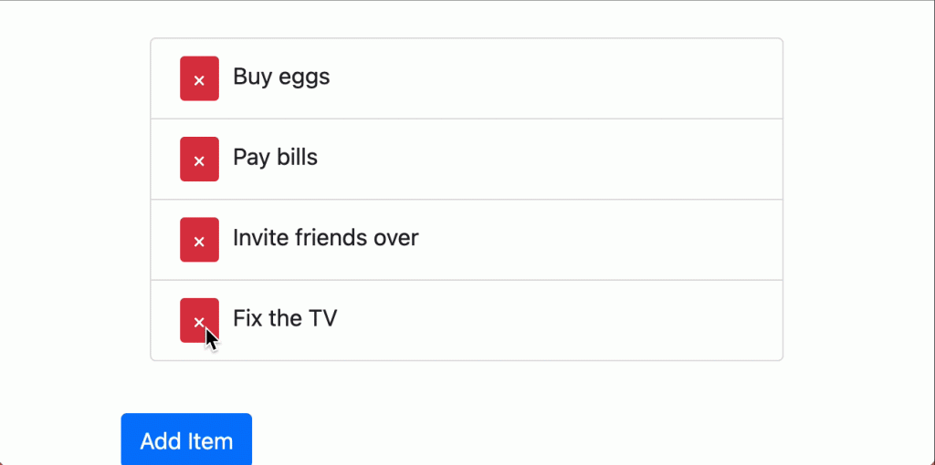
In the following example, we use a simple Todo List, adding a group transition to each todo list child component.
import React, { useState } from 'react';
import ReactDOM from 'react-dom';
import {
Container,
ListGroup,
Button,
} from 'react-bootstrap';
import {
CSSTransition,
TransitionGroup,
} from 'react-transition-group';
import uuid from 'uuid';
import './styles.css';
function TodoList() {
const [items, setItems] = useState([
{ id: uuid(), text: 'Buy eggs' },
{ id: uuid(), text: 'Pay bills' },
{ id: uuid(), text: 'Invite friends over' },
{ id: uuid(), text: 'Fix the TV' },
]);
return (
<Container style={{ marginTop: '2rem' }}>
<ListGroup style={{ marginBottom: '1rem' }}>
<TransitionGroup className="todo-list">
{items.map(({ id, text }) => (
<CSSTransition
key={id}
timeout={500}
classNames="item"
>
<ListGroup.Item>
<Button
className="remove-btn"
variant="danger"
size="sm"
onClick={() =>
setItems(items =>
items.filter(item => item.id !== id)
)
}
>
×
</Button>
{text}
</ListGroup.Item>
</CSSTransition>
))}
</TransitionGroup>
</ListGroup>
<Button
onClick={() => {
const text = prompt('Enter some text');
if (text) {
setItems(items => [
...items,
{ id: uuid(), text },
]);
}
}}
>
Add Item
</Button>
</Container>
);
}The setup is the same as our Transition, except that we set an iterable key, wrapping the children in a TransitionGroup component. Our animation is handled by the child CSSTransition, and just like a single component, the CSS is applied the same way, except that it’s applied to every child. Here’s our CSS:
.todo-list {
  padding: 20px;
}

.item-enter {
  opacity: 0;
  left: 100%;
}

.item-enter-active {
  opacity: 1;
  left: 0%;
  transition: all 500ms ease-in;
}
.item-exit {
  opacity: 1;
  right: 0%;
}
.item-exit-active {
  right: -100%;
  transition: all 500ms ease-in;
}
As for the Group component, we only apply an exit prop to enable our exit transitions. Without it, we would lose the animation when removing an item from our list.
Summary
Those are the basics of the React Transition Group library, and hopefully you found React animations to be much less intimidating. These are all simple animations, but there are many more articles to come covering more advanced animations.
No Comments