
MUI Themes Fully-Featured with MUI v5
I’ve already covered how to add a theme to Material-UI version 4, but what about MUI Themes? With v5 we have a lot of new features to make theming a lot easier, and we also ended up with a whole new override system. If there is a great reason to move to v5, it would be theming. The process is still very much the same, but what you can do, and how to apply the theme is very different. Let’s look at how to create and add a theme to your app, and the many new ways it can make styling components quick and easy with overrides and variants.
We’ll be covering themes specifically in this article, so check out MUI v5 with Emotion if you’re looking for styling in MUI v5.
When you think of a theme, you may think specifically about the ability to have multiple themes. While we can certainly do that, theming can also make our app styling loads easier. All of MUI’s components are based on a defaultTheme, so when we create a custom theme we can manipulate every component. With theming in MUI v5, we are basically creating a styling blueprint for our app.
To make it easy to see how MUI v5 theming works without needing to create a new project, checkout my CodeSandbox MUI Templates.
Adding Our MUI Theme Provider
Before anything, let’s get the easy part out of the way. We start by wrapping the root of our app with MUI’s ThemeProvider. We use the createTheme hook to create a default MUI theme that we can pass on to the provider. Once this is in place, all child MUI components will be automatically styled by the theme.
// index.js
import { createTheme } from "@mui/material/styles";
import { ThemeProvider } from "@mui/material/styles";
import { CssBaseline } from "@mui/material";

import App from "./App";

const theme = createTheme()

const rootElement = document.getElementById("root");
ReactDOM.render(
  <ThemeProvider theme={theme}>
    <CssBaseline />
    <App />
  </ThemeProvider>,
  rootElement
);
Now that we have the theme provider setup, let’s create our own custom theme.
Creating a Custom MUI Theme
While we are replacing the Default Theme, it does make for a good example of how the theme is formed.
Let’s start by finally adding some color to our theme. We do this by passing an object to our createTheme hook, and add a palette object property. The palette object holds all of the color objects accessed by MUI’s components. Visual MUI components have a color property that give you the options primary, secondary, info, warning, success, and error. We can find each one of these in our palette object. In each one of these objects we have a dark, main, and light property, giving us tonal differences to work with.
We start by creating a new theme.js file, and adding the following to it:
// theme.js
import { createTheme, responsiveFontSizes } from "@mui/material/styles";

import red from "@mui/material/colors/red";
import orange from "@mui/material/colors/orange";
import yellow from "@mui/material/colors/yellow";
import green from "@mui/material/colors/green";
import lightBlue from "@mui/material/colors/lightBlue";
import grey from "@mui/material/colors/grey";

const theme = (mode) =>
  createTheme({
    palette: {
      mode: 'light',
      primary: {
        main: orange[500]
      }
      secondary: {
        light: red[500],
        main: red[700],
        dark: red[900],
        contrastText: grey[50]
      },
      error: {
        light: red[400],
        main: red[500],
        dark: red[300],
        contrastText: grey[800]
      },
      success: {
        main: green[500]
      },
      warning: {
        main: yellow[500],
        contrastText: grey[800]
      },
      info: {
        main: lightBlue[500]
      },
      text: {
        primary: grey[900],
        secondary: grey[700],
        disabled: grey[500]
      },
      action: {
        active: red[200],
        activeOpacity: 1,
        disabled: grey[700],
        disabledBackground: grey[200],
        hover: red[100],
        hoverOpacity: 0.7,
        focus: red[600],
        focusOpacity: 1,
        selected: red[300],
        selectedOpacity: 1
      },
      background: {
        default: orange[300],
        paper: grey[200]
      },
      common: {
        black: grey[900],
        white: grey[200]
      },
      tonalOffset: 0.2
    }
  });

export default theme;
Now we can import our theme directly, and pass it to the ThemeProvider we added earlier.
// index.js
import { ThemeProvider } from "@mui/material/styles";
import { CssBaseline } from "@mui/material";

import App from "./App";
import theme from "./theme";

const rootElement = document.getElementById("root");
ReactDOM.render(
  <ThemeProvider theme={theme}>
    <CssBaseline />
    <App />
  </ThemeProvider>,
  rootElement
);
Besides our common colors, we also have a text object for the text components, a background color for the main background of the app, and a paper color for our modals and drawers. Components will style differently depending on the mode of the theme, which is dark or light. The common object which has a standard black and white color, and the grey object set the colors for many finer details. For instance, tooltip backgrounds, hover/focus backgrounds, and other less customized stylings. The grey object is mostly used various effects and shadows, usually when in dark mode.
Lastly, our action object handles all of our action-based colors. For instance, button hover background colors, text link colors, disabled background and text colors, and of course the opacity for each of the background colors. That’s some serious fine tuning!
Automatic Colors
You may have noticed that some palette colors in our theme only have the main color property set. One great feature with the palette is the ability to create color palettes without having to specifically set each property. When we set the main color, the dark, light, and contrastText are automatically created. The amount these colors are contrasted between each tone is controlled by the tonalOffset property, which is also in our palette object. The contrastText is also set, and to make sure its always visible it is set based on the lightness of the color.
Component Shaping
To set the look of our component shape, we add a shape object with our borderRadius of 20, as well as a spacing set to 4 pixels. In my opinion, one of the most powerful features of the theme is the spacing. Spacing determines the factor margins and padding are based. When using spacing you ensure all components are aligned and never offset. If this is a new concept, I would highly suggest reading Refactoring UI 2.0 which goes over this in great detail.
    palette: {
      ...
    },
    shape: {
      borderRadius: 20
    },
    spacing: 4
When we use the sx props shorthand, we’re setting alignment based on the spacing. For example:
let style = {
  container: {
    borderRadius: 1, // borderRadius: 20px (1 * theme.shape.BorderRadius)
    m: 6,            // margin: 24px (6 * theme.spacing)
    py: 9,           // padding: 36px 0 36px 0 (9 * theme.spacing)
    px: 6,           // padding: 0 24px 0 24px
    textAlign: "center"
  }
}

return (
  <Box sx={style.container}>
  ...
As you can see quickly see, the shorthand in the sx prop is based on our shaping settings, with the majority coming from our spacing.
Typography Theming
MUI’s Typography component gives you a single component to wrap all of you text. With this one component we use its variants to style our text using MUI. Within our theme we can style each typography variant, as well as the global font settings.
typography: {
  fontFamily: ["Roboto", "Lato", "Sans Serif"],
  fontSize: 16,
  fontWeightRegular: 400,
  fontWeightBold: 700,
  lineHeight: 1.5,
  h1: {
    fontFamily: "Lato",
    color: grey[100],
    fontSize: "6rem",
    fontWeight: 400,
    lineHeight: 1.167,
    lettingSpacing: "-0.01562em"
  },
  body1: {
    color: grey[800],
    fontSize: "2rem",
    fontWeight: 400
  }
},
In this example, you can see with the h1 variant that we have a lot of options for styling. If we refer back to the defaultTheme, we can see we have settings for every variant.
Theming Regular Components
There may be times when you want to use your themes to style non-MUI components. When this happens, we access our theme object using the useTheme hook. The object that’s returned is our theme object, giving us direct access. Here’s an example of a dumb component using the theme hook to directly access the theme:
import React from 'react'
import { useTheme } from '@mui/material/styles'

const someComponent = () => {
   const theme = useTheme()

   const style = {
     container: {
       margin: theme.spacing(3), // margin: 12px
       padding: theme.spacing(2, 3) // padding: 8px 12px 8px 12px
       color: theme.palette.primary.contrastText,
       backgroundColor: theme.palette.primary.dark
     }
   }

   return (
     <div style={style.container}>
       Maybe some text?
     </div>
   )
}

export default someComponent
Component Overrides using MUI Themes
It’s a lot easier when we want to style our MUI components. Instead of styling the components directly, we can override the default theme with component overrides. We do this in the theme itself, within a components object. In this object we tell it the component type class we want to override. Each MUI component class name starts with Mui, so we prefix each component name with Mui. For example, we want to override the Typography component, using MuiTypography.
In our overrides we can set the default props of each component, and that’s not limited to the style prop. Basically we can set the default props of any component simply by setting it in the theme. Let’s test this out by setting the default props for the MUI Button.
palette: {
...
},
components: {
MuiButton: {
defaultProps: {
color: "warning",
size: "small",
disableElevation: true,
variant: "contained"
}
}
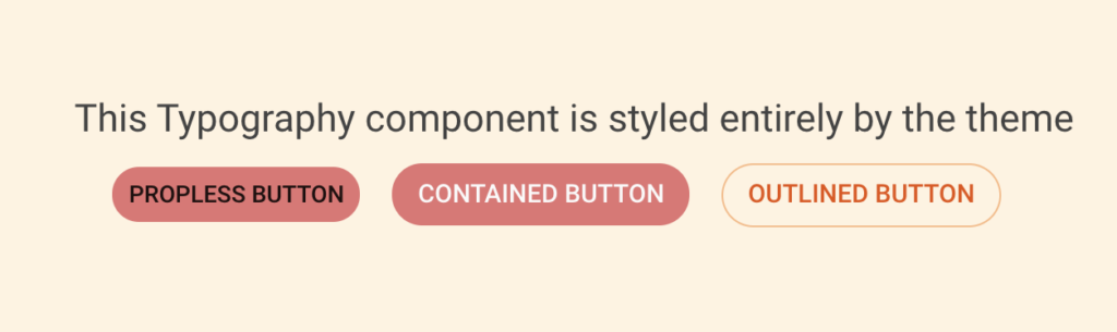
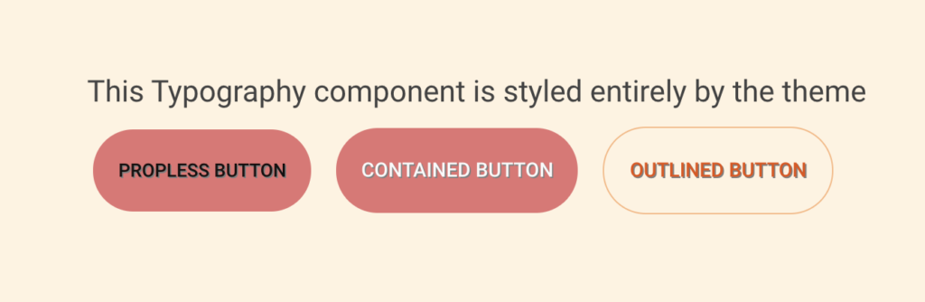
}If we setup 3 buttons like so…:
<Button>Propless Button</Button>
<Button color="primary" variant="contained" size="medium">
  Contained Button
</Button>
<Button color="secondary" size="medium" variant="outlined">
  Outlined Button
</Button>
We’ll end up with 3 buttons that look like this:
Of course, we can also override the style prop for each component as well:
components: {
  MuiButton: {
    defaultProps: {
      color: "warning",
      size: "small",
      disableElevation: true,
      variant: "contained"
      style: {
        shadow: "1px 1px grey"
      }
    }
  }
}
Why stop there? Let’s override the sx prop itself, and use the theme to style theme:
components: {
  MuiButton: {
    defaultProps: {
      color: "warning",
      size: "small",
      disableElevation: true,
      variant: "contained"
      style: {
        textAlign: "left"
      },
      sx: {
        borderRadius: 2,
        p: 5
      }
    }
  }
}
Component Variants
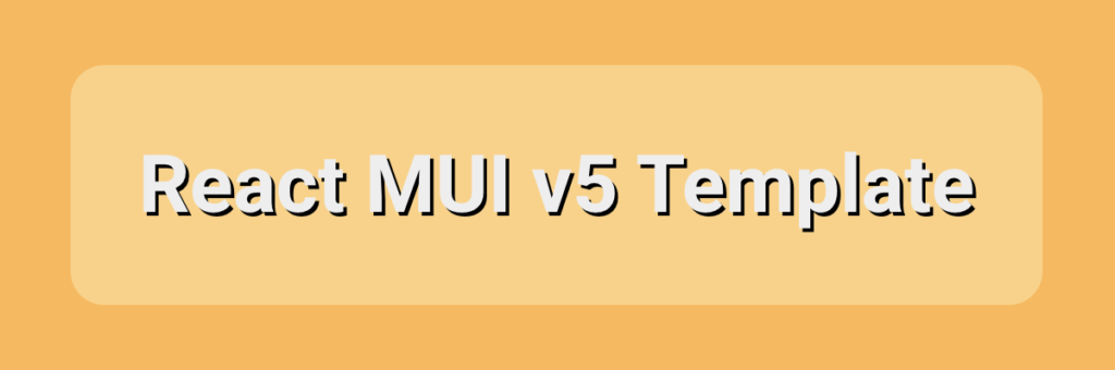
Overrides are great, but that limits our component to a single style. What if you want a component to have multiple styles? You use custom variants! We can create variants in the variant array of our overrides, and determine the component based on the props set, and even based on a non-existent variant. In the following example we create a variant of the Typography component, with the variant set to test.
components: {
  MuiTypography: {
    variants: [
      {
        props: { variant: "test" },
        style: {
          color: grey[200],
          fontSize: 80,
          fontWeight: 800,
          textShadow: "2px 2px black"
        }
      }
    ],
    defaultProps: {
      style: {
        textAlign: "right"
      }
    }
  }
}
When we use a Typography component with this variant set…
<Typography variant="test">
  React MUI v5 Template
</Typography>
…we end up with a component with our overrides:
Dynamic Modes in MUI Themes
Every theme in MUI has a mode which tells the provider if the theme is light or dark. The default theme manages several values based on the mode used, which you can find in the docs for Dark Mode. We can offer similar behavior when using a custom theme by implementing it directly into the theme itself. Here we automatically set the primary color based on the mode set when the theme is started.
const theme = (mode) => createTheme({
  palette: {
    mode,
    ...(mode === "light"
      ? {
          primary: {
            light: green[300],
            main: green[500],
            dark: green[700],
            contrastText: grey[50]
          }
        }
      : {
        primary: {
          main: red[600]
        }
      }
    })
  }
});

export default theme('dark');
With this we can use state to adapt our theme based on mode needed, and without having to manager two separate themes.
Summary
And that’s how you can truly take advantage of MUI themes. There is still more you can do in terms of responsive design, but I’m going to leave that for a separate article. If you enjoyed this article, have questions, or want to know more please comment below. Until next time, happy coding!
Comments: 3
Nice Dept Article for mui v5.
Not much good content available as of now but this was very helpful
Glad it was helpful! Was there another topic or another feature in particular you would have liked to have seen covered in this article or another?
Thank you, really well explained!