Material UI Themes in React
An additional theme being added to your app, not only adds character to your application, but can also increase accessibility to app. While the Material-UI documentation hasn’t always been clear on how to accomplish this, it’s actually an easy system to become accustom to. We’ll quickly go over how to implement themes and how to avoid the problems that can arise when doing so, as well as bonus of applying your global css with Material-UI.
To keep this article short, I’m going to assume anyone reading, is already aware of how to use the Material-UI styling system, and with hooks. For those looking to add a theme in MUI v5, I will discuss how to adapt a v4 theme to v5 later in this article. Are you looking for an article on how to style in MUI v5? If so, be sure to check my articles on MUI v5 Styling with Emotion and MUI Themes with MUI v5.
Lastly, if you need a good starting project for Material-UI or MUI, checkout my CodeSandbox MUI Templates.
Creating a Material UI Theme
Creating a theme in Material UI is quite simple. The concept requires you to create a custom theme object using the creatMuiTheme constructor, then using that as your theme template. To create such an object, we can do the following:
import red from '@material-ui/core/colors/red'
import lightBlue from '@material-ui/core/colors/lightBlue'
import grey from '@material-ui/core/colors/grey'
import { createMuiTheme } from '@material-ui/core'

const DarkTheme = createMuiTheme({
  themeName: 'My Dark Theme',
  palette: {
    type: 'dark',
    primary: primary: {
      light: lightBlue[500],
      main: lightBlue[600],
      dark: lightBlue[800],
      contrastText: grey[50]
    },
    secondary: red,
    error: red
  },
  overrides: {
    MuiTooltip: {
      root: {
        color: grey[800]
      }
    }
  },
  spacing: 4
})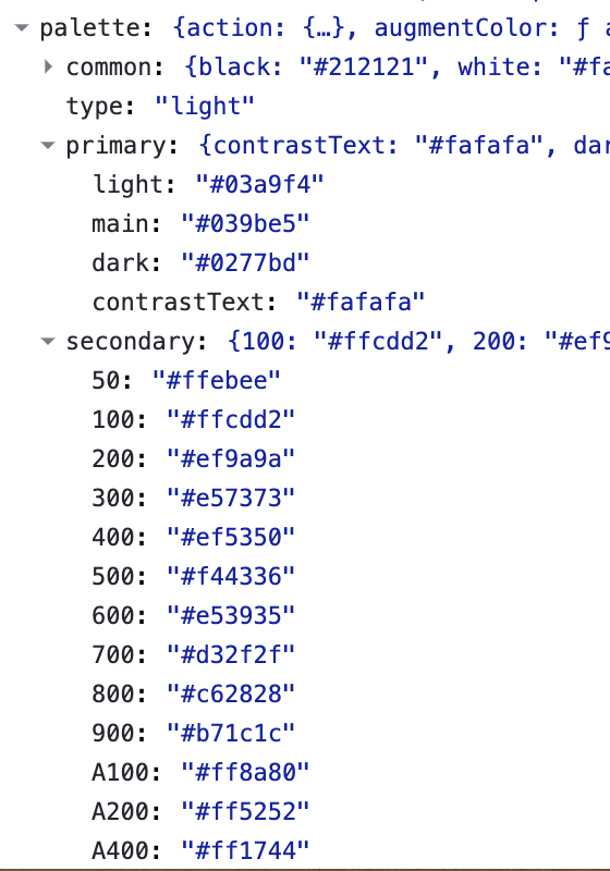
color objects
The MUI components use colors that come from this palette object. The primary, secondary, and error sections make up the common hues used. You may also notice that the primary and secondary objects are styled differently. When setting the colors explicitly, you use a common object and keys. The main and contrastText values are the required keys. In the same object, you can also set the light and dark values. If you want to set a single color for one of these objects, you can use a MUI color object instead. With this, the main, light, dark, and contrastText values will be set automatically.
Setting the colors of the theme is only part of the appeal of using a theme, other benefits come from the component overrides. Overrides allow you to set a style for each MUI component. You can also set the app’s font, shadows, animation timing, and spacing.
The MUI library is styled with these each theme setting, so changing settings affects each MUI objects in you app. In the example theme, we set the styling for the MUIToolTip-root class, giving the ToolTip’s root component a manual styling. The best way to find the class name, is with the React DevTools. With it you can check the classes and the styles applied to each component.
Adapt Your Theme to MUI v5
You can use the adaptV4Theme adapter with your theme when you want you theme ready for a MUI v5 upgrade:
import { adaptV4Theme, createTheme } from '@mui/material/styles'

const Theme = createTheme(adaptV4Theme({
  ...
This will allow you to ease your way into the v5 theme setup, without having to change it all when upgrading. Be sure to check the MUI v5 Styling Article and see what has been added and changed with version 5.
Theme Spacing
The theme’s spacing object is by far the most powerful tool in the theme. Adam Wathan’s, Refactoring UI covers many great practices and examples to show these benefits. For the most part, your app should have uniform spacing across all components. By normalizing your margins and spacings, each component ends up with equal spacing.
With Material UI themes, you set your base spacing size so all MUI components are spaced evenly. In our example we use a 4px base, and components are spaced with multiples of 4 (4, 8, 12, 16, etc). When we style a component with Material UI we can set these easily:
const useStyles = makeStyles(theme => ({
    root: {
      color: theme.palette.primary.main,
      cursor: 'pointer',
      fontSize: 16,
      margin: theme.spacing(0, 1), // 0px, 4px
      padding: theme.spacing(2) // 8px
    }
  }))
Now that we know how to create our theme, let’s look at how to implement it.
Adding your Material Theme
Using the ThemeProvider component, we can add our theme to our app:
<ThemeProvider theme={MyDarkTheme}>
  <App />
</ThemeProvider>
With the existing theme object, we only need to pass the theme in order for the children to access it. Now that the ThemeProvider is added, we see even more options available in our theme. Since it is taking the place of the default theme, we can see the new objects in the theme state. Opening the React DevTools, we see the available options within the ThemeProvider’s theme props:
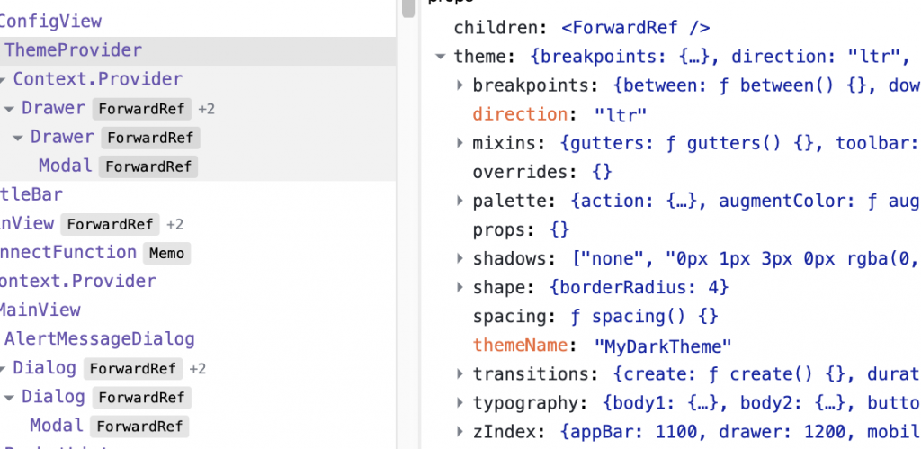
Any of the objects found in the ThemeProvider theme props, can be used in our theme for a better overall customization.Nested Material-UI Themes
When creating a theme, you often want to create a dark and light theme. What do you do when a section of your app needs its own static theme? At that point you will want a nested theme provider. Wrap an additional ThemeProvider object around the children that need to take on the new theme.
Breaking Styles with Nested Themes
The most common issue is finding a component that isn’t taking on the theme, or is using the base styles over either theme (translucent background). If you look at the component in the devtools inspector, you’ll find the style for the theme has been applied, but is overridden by the base component style. If you find that the components are no longer updating the styles due to a collision of class names, and you’re using MUI 4 or lower, the fix is to wrap the children with a JssProvider component.
With this, you need to specify a class prefix for one of the ThemeProviders, allowing them work independently without collision:
import { createGenerateClassName, StylesProvider } from '@material-ui/core/styles'

const generateClassName = createGenerateClassName({
  productionClassPrefix: 'App'
})

return (
  <StylesProvider generateClassName={generateClassName}>
    <ThemeProvider theme={MyDarkTheme}>
      <App />
    </ThemeProvider>
  </StylesProvider>
)
Doing this will allow you to get around this collision, just keep in mind that you will need to do this for each of your nested ThemeProviders.
BONUS: Global Styling
It's not very obvious how to set global styling with MUI without having to use an external library or the built-in styled-components library. As a bonus, let's go over how to accomplish this, so you can restrict your styling to a single library. First, we will start by creating a Global Styling object that will provide the styling.import { makeStyles } from '@material-ui/core/styles'
const AppGlobalCss = props => {
const useStyles = makeStyles({
'@global': {
'#app, html': {
height: '100%'
},
'ul::-webkit-scrollbar': { width: '0 !important' },
'div::-webkit-scrollbar': { width: '0 !important' }
}
})
useStyles()
return props.children
}As you can see, we’re using a makeStyles hook to apply the styles to the child component. While we could add this to a component’s style directly, but since we’re applying to the root of the app, we want something that can be used in a class-based root component, so we made a Higher-Order-Component instead.
Now that we have our HOC styling component ready, here is how to apply it to our app:
return (
  <StylesProvider generateClassName={generateClassName}>
    <ThemeProvider theme={MyDarkTheme}>
      <GlobalAppCss>
        <App />
      </GlobalAppCss>
    </ThemeProvider>
  </StylesProvider>
)
It’s as simple as that, and you have styled your entire app using Material-UI, with no need for anything else.
No Comments