Page Transitions in Gatsby with TransitionLink
When you want your apps and sites to look as great as possible, animations are a key addition to really make it shine. With any app that utilizes routing, you can use the Transition Link library to add page transitions into your links. So let’s look at how to add these animations to a new Gatsby app using Transition Link components and hooks.

TransitionLink Setup
Transition Link provides a React wrapper to the GSAP (GreenSock Animation Platform), allowing you to create and trigger custom animations when navigating to another page.
To quickly get our Gatsby app ready to use the library, we install the plugin, and the gsap library, and add the plugin to the gatsby-config’s plugins array.
$ yarn add gatsby-plugin-transition-link gsapFor more details, you can find the Gatsby documentation for the gatsby-plugin-transition-link plugin here.
Predefined Page Transitions using AniLink
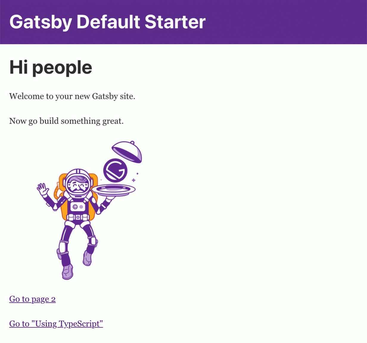
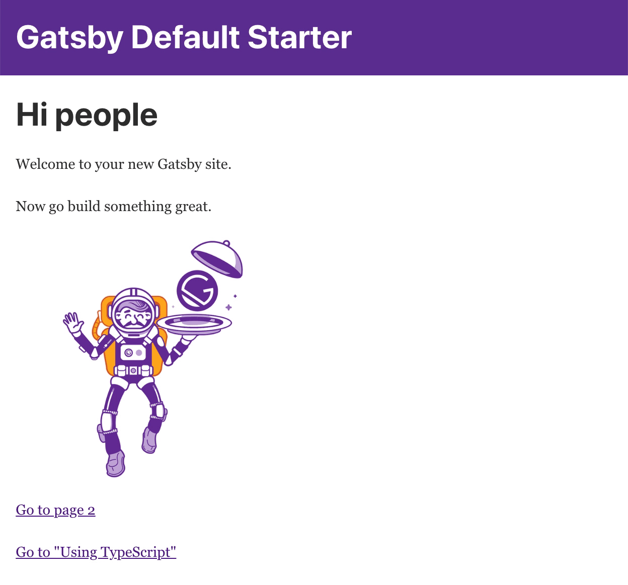
If you’re new to GSAP, no worries. Transition Link has you covered with pre-defined animations which work really well. The two we’ll look at are the paintDrip and swipe. The paintDrip is a great little animation that looks like this:
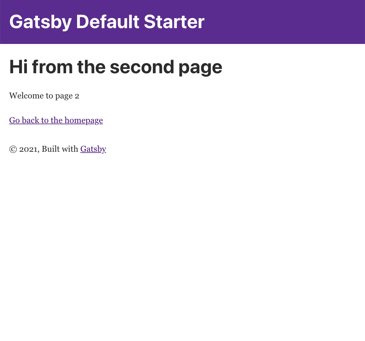
For the TypeScript link, we’ll use the swipe transition, which is a single property change from the previous:

Now let’s look at the code we added to make this possible:
import * as React from "react"
import { Link } from "gatsby"
import AniLink from "gatsby-plugin-transition-link/AniLink"
import { StaticImage } from "gatsby-plugin-image"

import Layout from "../components/layout"
import Seo from "../components/seo"

const IndexPage = () => (
  <Layout>
    <Seo title="Home" />
    <h1>Hi people</h1>
    <p>Welcome to your new Gatsby site.</p>
    <p>Now go build something great.</p>
    <StaticImage
      src="../images/gatsby-astronaut.png"
      width={300}
      quality={95}
      formats={["auto", "webp", "avif"]}
      alt="A Gatsby astronaut"
      style={{ marginBottom: `1.45rem` }}
    />
    <p>
      <AniLink paintDrip color="rebeccapurple" component={Link} to="/page-2/">Go to page 2</AniLink> <br />
      <AniLink swipe direction="left" component={Link} to="/using-typescript/">Go to "Using TypeScript"</AniLink>
    </p>
  </Layout>
)

export default IndexPage
As you can see, it’s incredibly simple when using AniLink, and it has a few different props available to customize the component to your needs. We’re giving a named color for the color property, but you’ll often want to give it a raw hex color, for example directly from a MUI theme. When you do, there is an alternate property hex, which can take hex colors.
With the swipe transition, we can set the direction of the transition, as well as if the top is the entry or exit of the transition. All of the AniLink transitions are all fairly straight-forward, but are somewhat limited in their customization. Let’s add one more, and use the cover transition for our back button on page-2. Here’s the link code:
<AniLink cover to="/" color="rebeccapurple">Go back to the homepage</AniLink>And here’s what we’ll see:
As you can already see, the AniLink transition are really simple. The pre-defined transitions available through AniLink are Cover, Fade, Morph, PaintDrip and Swipe. To see more of the properties these components offer, check out the AniLink docs. Though if you want to gain a complete understanding of what’s available, it’s best to check out the AniLink source.
Page Transitions with TransitionLink
When AniLink isn’t enough, TransitionLink is your next step. With it, Transition Link uses an event trigger to start your animation, and you have the flexibility to make that anything you want. First we need to create an animation function for our trigger to use. Since explaining the process warrants a separate article, I’m simply using the transition from the AniLink’s swipe, and putting it into its own file we can use for our transitions.
// swipe.js
import gsap from 'gsap'

const boxShadow = '0 0 100px 10px rgba(0, 0, 0, 0.12941176470588237)'

const swipeTopDirection = (direction, reverse) => {
  const polarityPos = reverse ? '-' : '+'
  const polarityNeg = reverse ? '+' : '-'

  switch (direction) {
    case 'down':
      return { y: `${polarityPos}=100vh`, ease: "power1.easeIn" }
    case 'up':
      return { y: `${polarityNeg}=100vh`, ease: "power1.easeIn" }
    case 'left':
      return { x: `${polarityNeg}=100%`, ease: "power1.easeIn" }
    default:
      return { x: `${polarityPos}=100%`, ease: "power1.easeIn" }
  }
}

const swipeBottomDirection = (direction, reverse = false, offset = 40) => {
  const polarityPos = reverse ? '-' : ''
  const polarityNeg = reverse ? '' : '-'

  switch (direction) {
    case 'down':
      return { y: `${polarityNeg}${offset}vh`, ease: "power1.easeIn" }
    case 'up':
      return { y: `${polarityPos}${offset}vh`, ease: "power1.easeIn" }
    case 'left':
      return { x: `${polarityPos}${offset}%`, ease: "power1.easeIn" }
    default:
      return { x: `${polarityNeg}${offset}%`, ease: "power1.easeIn" }
  }
}

export const swipe = ({ node, exit, direction, top, triggerName, entryOffset }) => {
  const scrollTop =
    (document.scrollingElement && document.scrollingElement.scrollTop) ||
    document.body.scrollTop ||
    window.pageYOffset

  if (triggerName === 'entry' && top === 'entry') {
    return gsap.timeline()
      .set(node, {
        boxShadow: boxShadow,
        overflowY: 'hidden',
        height: '100vh',
        scrollTop: scrollTop,
      })
      .from(node, { ...swipeTopDirection(direction, true), duration: exit.length })
      .set(node, { overflowY: 'initial' })
  } else if (triggerName === 'entry') {
    return gsap.timeline().from(
      node,
      {
        ...swipeBottomDirection(direction, false, entryOffset),
        duration: exit.length,
      }
    )
  } else if (triggerName === 'exit' && top === 'exit') {
    return gsap.timeline()
      .set(node, {
        boxShadow: boxShadow,
        overflowY: 'hidden',
        height: '100vh',
        scrollTop: scrollTop,
      })
      .to(node, { ...swipeTopDirection(direction), duration: exit.length })
      .set(node, { overflowY: 'initial' })
  } else {
    return gsap.timeline()
      .set(node, {
        boxShadow: boxShadow,
        overflowY: 'hidden',
        height: '100vh',
        scrollTop: scrollTop,
      })
      .to(
        node,
        {
          ...swipeBottomDirection(direction, true, entryOffset),
          duration: exit.length,
        },
      )
      .set(node, { overflowY: 'initial' })
  }
}
In my Gatsby project, I have placed this file in src/transitions, as swipe.js. Let’s now look at how we can use this function to trigger a swipe animation.
Now that we have an animation to trigger, let’s now look at how we can trigger it with Transition Link.
Using the TransitionLink Component
Our first and more obvious option is to create a wrapper component. I copied the index page to a new page, and used the following as the page code. As you can see right off the bat, there is a lot more involved in creating our transition. Just like the AniLink component, we have variables for our direction, top, and duration. Looking at these same variables, you can quickly see how they affect the transition, deciding where the animation starts, how long it lasts, and where on the screen it is. The most important options are our entry and exit properties which handle the animation triggers.
const TransitionLinkPage = props => {
  const direction = props.direction || 'right'
  const top = props.top || 'exit'
  const entryOffset = 40
  const exitLength = props.duration || 0.7
  const entryLength = exitLength / 3.5
  const entryZ = top === 'entry' ? 1 : 0
  const exitZ = top === 'exit' ? 1 : 0

  return (
    <Layout>
      <TransitionLink
        entry={{
          length: entryLength,
          trigger: ({ node, exit }) =>
            swipe({ node, exit, direction: 'right', top: 'exit', entryOffset: 40, triggerName: 'entry' }),
            zIndex: 0
        }}
        exit={{
          length: exitLength,
          trigger: ({ node, exit }) =>
            swipe({ node, exit, direction: 'right', top: 'exit', entryOffset: 40, triggerName: 'exit' }),
            zIndex: 1
        }}
        to="/">
          Go Back to the homepage in style! 🎉
      </TransitionLink>
      <br /><br />
      <Link to="/">Go back to the homepage the boring way 👎.</Link>
    </Layout>
  )
}
Generally the entry is the start of our animation once clicking the link, with the exit being the animation when the transition completes. With our swipe transition we’re only using the exit, so we can comment out the entry setting and see the same thing. If we switch the top variable to entry, this is reversed. We could make this a dynamic component, where app state decides to use the entry or exit transition. Neat huh?
Transitions with the TransitionLink Hook
What if we had a page with thousands of links? We certainly wouldn’t want to wrap each and every one with even more link components, we would end up creating thousands of new elements, causing our page performance to drop drastically. While the Transition Link documentation doesn’t actually cover it, there is a Transition Link hook you can use for page transitions. To use this hook, we import the useTriggerTransition hook to our page, and create our transition hook in our page. Within the hook we set our to link, entry, and exit. Once set, we simply pass it to whatever leaf component to use in a button component’s onClick event.
import { useTriggerTransition } from "gatsby-plugin-transition-link/hooks/useTriggerTransition"
import { swipe } from '../components/transitions/swipe'

const SomePage = props => {
  const direction = props.direction || 'right'
  const top = props.top || 'exit'
  const entryOffset = 40
  const exitLength = props.duration || 0.7
  const entryLength = exitLength / 3.5
  const entryZ = top === 'entry' ? 1 : 0
  const exitZ = top === 'exit' ? 1 : 0

  const swipeTransition = useTriggerTransition({
    to: `/`,
    exit: {
      length: exitLength,
      trigger: ({ node, exit }) =>
        swipe({ node, exit, direction: direction, top, entryOffset, triggerName: 'exit' }),
        zIndex: 1
    },
    entry: {
      length: entryLength,
      trigger: ({ node, exit }) =>
        swipe({ node, exit, direction: direction, top, entryOffset, triggerName: 'entry' }),
        zIndex: 0
    }
  })

  return (
    <Layout>
      <Seo title="Using Transition Link" />
      <h1>Gatsby supports TypeScript by default!</h1>
      <button onClick={swipeTransition}>Go Back to Homepage with click event</button>
      <br /><br />
      <Link to="/">Go back to the homepage the boring way 👎</Link>
    </Layout>
  )
}
While in this example we’re simply using a single button, in practice we could use a dynamically created route, passing our transition function to an array of child components to trigger.
That’s it for transition link! If you enjoyed this article, and want to see more about transition link or green sock, let me know in a comment below! Until then, happy coding!
No Comments